Fagmøbler
My Page for Fagmøbler, one of Norway's largest furniture chains.
About the project
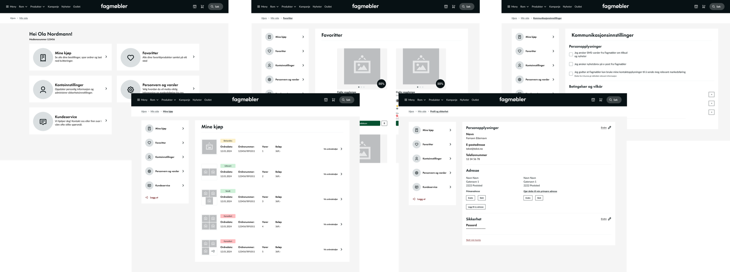
Through TRY Dig, I designed a new My Page for Fagmøbler. Customers can follow their orders and deliveries, and choose how they are contacted: by SMS, email or newsletter.
Method
The design builds on research from the Baymard Institute, which has done large studies of e-commerce. Their findings on account pages, navigation and what users expect shaped many of the choices.
Process
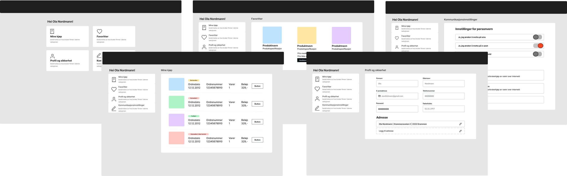
I started with sketches and wireframes in FigJam. It made it easy to try out ideas and get feedback from the client early.
Once the flows were approved, I moved the work into Figma and put the UX documentation right next to the design.
Content
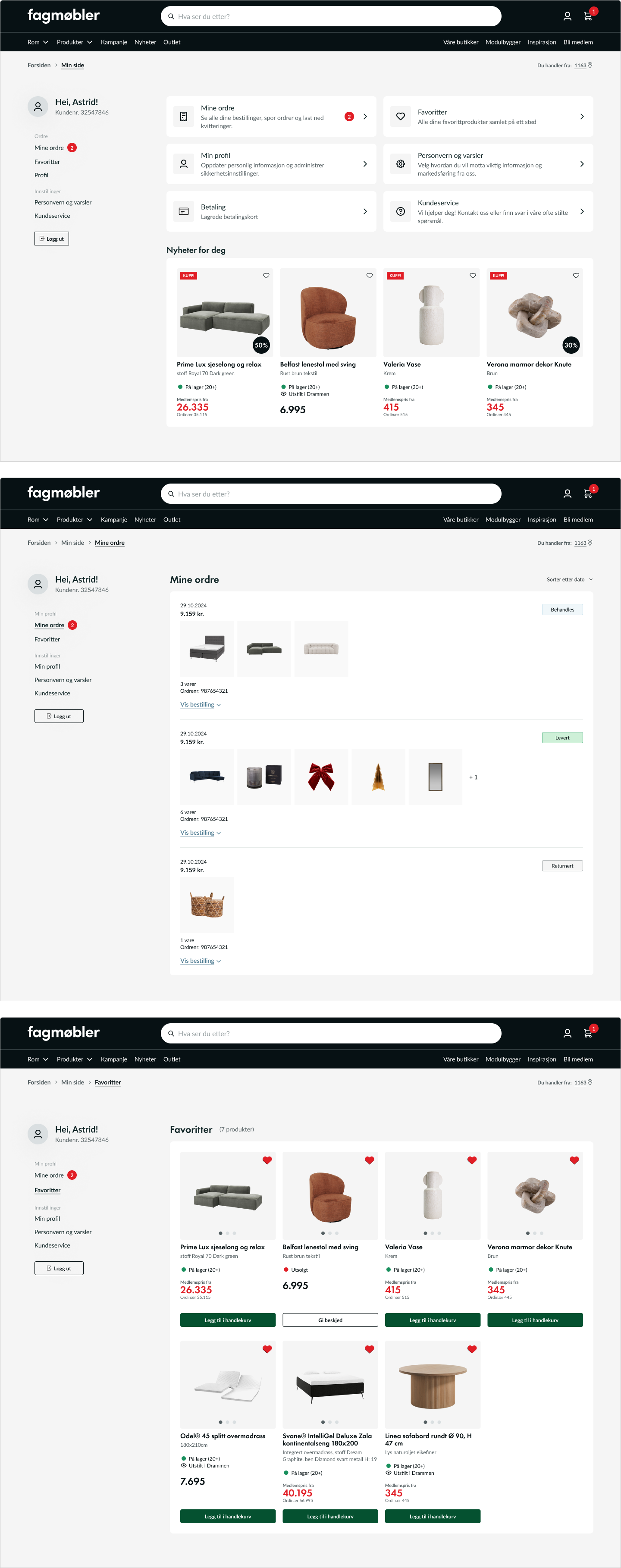
My Page has six parts:
- My orders: see all orders, track active deliveries and download receipts
- Favourites: save and organise products
- My profile: update personal details and security settings
- Privacy and notifications: control marketing and how you are contacted
- Payment methods: save and manage cards
- Customer service: a quick way to the help centre with FAQs and contact info
Handover
All patterns and decisions were documented with comments directly in the design. It kept the UX consistent when the project moved into the UI phase, while leaving room for visual choices.
The documentation also makes it easier to develop the solution further later.
Result
Fagmøbler's customers now have a clear and trustworthy page for their purchases and account, built on e-commerce best practice.