Icelandia: City Sightseeing
A redesign for Reykjavik's City Sightseeing bus service, enhancing how tourists explore Iceland's capital.
A UX and UI redesign for Iceland's tourist bus interface through TRY Dig AS, transforming the navigation system with real-time tracking implementation, a design system for consistency and smoother hand-off and enhanced visual hierarchy for improved user experience.
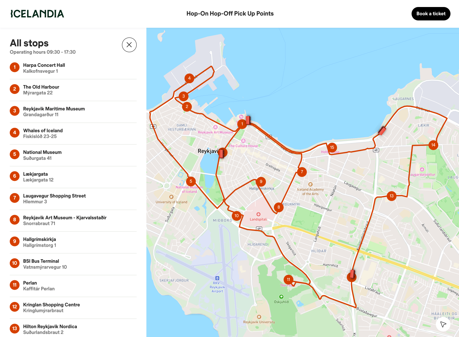
The existing tourist bus interface faced two critical issues. First, poor visual hierarchy where all elements – buses, stops, and routes – shared the same red color, making navigation difficult. Second, a problematic time display system where waiting times were based on fixed schedule points rather than actual bus location. For example, if a bus was scheduled for 14:15, the system would show "9 minutes" at 14:06, regardless of the bus's actual position. This rigid schedule-based approach, rather than real-time tracking, led to significant user frustration and confusion.

The starting point for redesign
The initial phase involved analyzing the existing color system and user pain points. User feedback identified that the monochromatic red scheme was causing significant confusion, particularly when users tried to distinguish between buses and stops on the map.
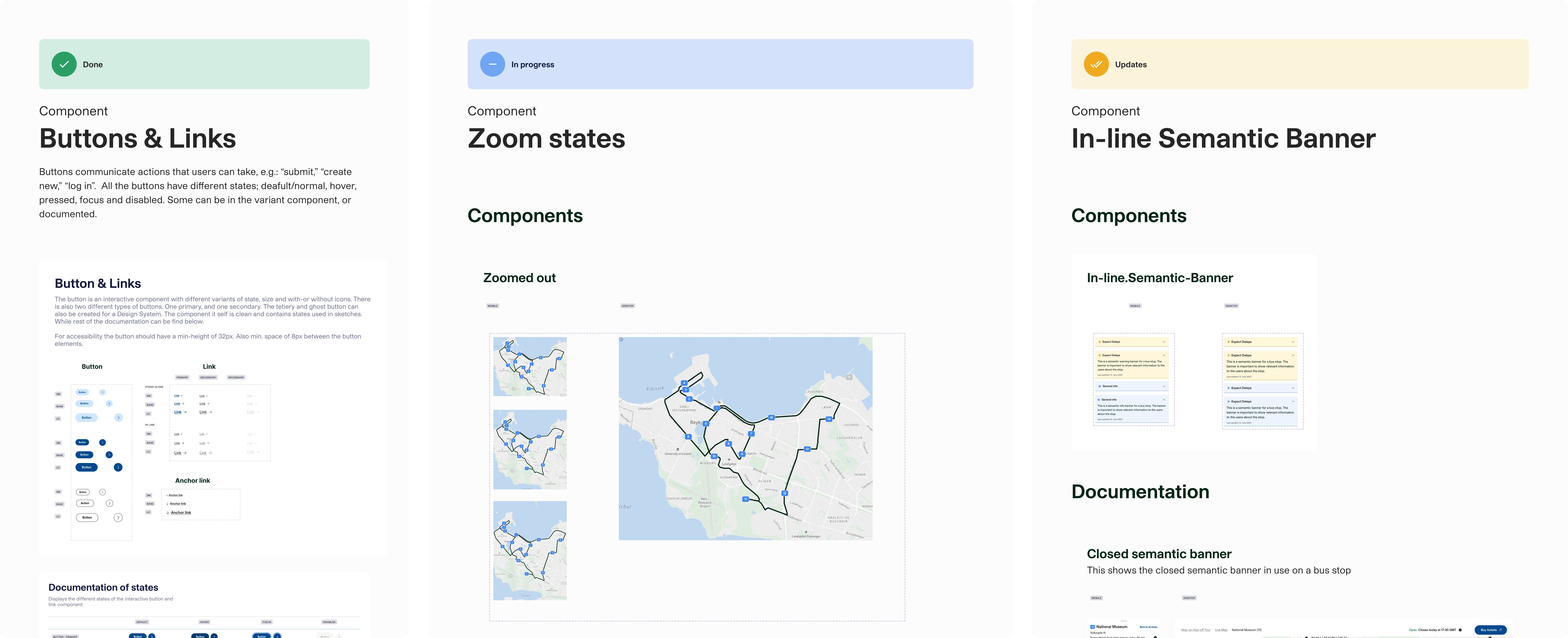
The new design system focused on clear visual hierarchy and component reusability. Key elements included:
- Buttons and links: The design system implements buttons and links with consistent sizing and hierarchy. Buttons come in three sizes (small, base, large)
and three style variants: primary (light blue), secondary (navy), and outline.
Each button can include a trailing icon to indicate actions.
The layout accommodates both standalone and full-width implementations to maintain flexibility across different contexts.
Links are categorized as either stand-alone or in-line. The system maintains consistent hover states and focus indicators across all interactive elements, ensuring both aesthetic coherence and functional clarity. - Map component states: The map interface was designed with various zoom states, ensuring information remained clear and useful at each level. This involved careful consideration of how different elements (buses, stops, routes) would scale and interact.
- Semantic elements:The design system implements a hierarchy of semantic alert elements to communicate different types of events. The error component is used for critical situations such as closed bus stops. The warning component alerts about challenges like icy conditions, while the info component conveys general information such as accessibility or temporary changes. This semantic framework supports both global events and notifications tied to individual stops, ensuring consistent and clear communication to the users about the service.
- Icon redesign: The bus and bus stop icons were completely redesigned to create clear visual distinction, which was the main pain point for the previous design. Each icon was designed to work across different device sizes while maintaining visibility.

A glimpse of the design system
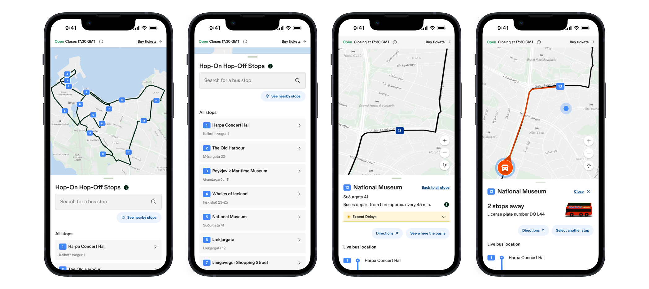
A major improvement was the shift from fixed schedule times to actual real-time tracking. Instead of showing countdown to pre-scheduled arrival times (without including delays). The new interface displays the bus's current location related to the chosen stop. This change directly addressed user feedback about the misleading nature of the previous system. The implementation required careful consideration of how to display dynamic timing information clearly while handling real-world variables like traffic delays and service changes. As a result of this, we also had to include semantic components so delays and/or bigger events can be annonced.
The redesign delivered several key improvements:
- Clear visual differentiation between service elements
- Accurate, real-time arrival information
- Consistent experience across devices
- Scalable design system for future development

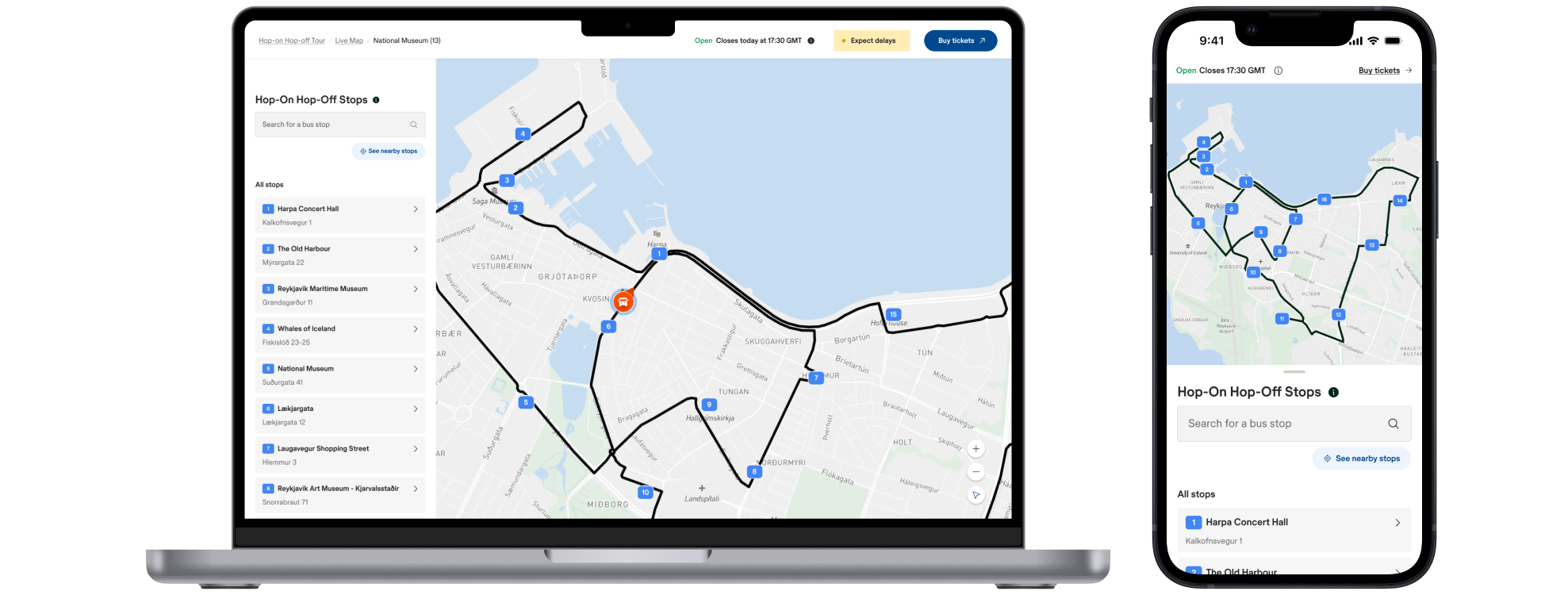
The result of the redesign process

The result of the redesign process
The design system was built using Figma, with components designed for both mobile and desktop implementations. Comprehensive documentation was created for the development team, including component specifications and interaction states.
The redesign demonstrates that focused design decisions can transform user experience. By separating visual elements through color and implementing real-time tracking, the service became more trustworthy and easier to navigate. These fundamental improvements addressed the core user needs: quick understanding of bus locations and reliable arrival times.
The redesign is now live. Have a look here.
Let's Connect
